Doctor on Demand Redesign
Develop Onboarding that Converts
Doctor on Demand is a direct-to-consumer telemedicine startup that was founded by Phil McGraw (a.k.a. “Dr. Phil”) and has completed over 3 million virtual patient visits.
OVERVIEW
Despite the huge influx of app downloads from Dr. Phil’s across-the-nation audience, very little of that interest ever converted to fully signing up, let alone patients actually setting up a video visit.
Working closely with the head of product (who I had previously collaborated on a WebMD mobile app), we set out to make a v2 o the app friendly and easy to use, in just a couple of months.
After release, the redesign increased daily video visits by 100+%.
MY ROLE
Sole designer
Working directly with VP of Product
2 Remote Engineers
PATIENT PAIN POINTS
Video visits were still a new concept.
Intake requirements meant lots of input before actually seeing a doctor.
Availability of a doctor was still spotty for some specialties.
DOCTOR ON DEMAND’S V1 CHALLENGES
The scrappy MVP app needed rethinking from the ground-up. When you landed on the first screen after download, the loudest CTA was the most misleading - “Call Now” was only possible if you had filled out the very difficult to read Symptoms and Allergies section. Furthermore, with only nascent staffing of new specialties such as Psychology, it would be impossible to get ahold of a doctor right away.

QUICK REBRANDING & STYLE GUIDE
The executive team really felt nervous about making any big changes, especially given the quick turnaround. My approach was to keep was working (the iconic “dr” of the logo, bright pops of color) and update the aspects that were not (cleaner visual style, warmer photography).
I whipped together different directions for the team to decide on in a week, knowing that it didn’t need to be perfect to move the ball forward on the overall redesign.
HOMESCREEN ORIENTATION
The first and most critical question I addressed was how to simplify the decision tree for users:
- Should it start with “now or later” for seeing a doctor?
- Or, should we play up the variety of specialty services and providers that users can select?

CONTEXTUAL DEVICES
We needed clear, contextual devices to help users along, since telemedicine still such a new process for most users. Progress bars up top helped users understand how far they’d gone in the multi-step intake, while the “celebratory” full-bleed color of the confirmation page helped re-affirm the importance of the appointment details.


Recommending product ideas
The last thing a worried and busy parent wants to do is to sort through a lot of appointment options. So I recommended a “quick book” option that could both reassure a user how quickly they could see a doctor, in addition to making scheduling as close to “one-touch” as possible.
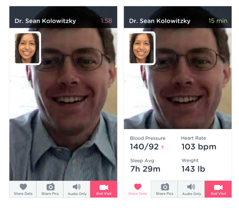
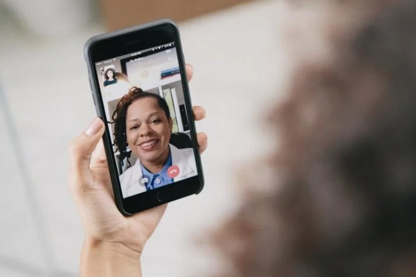
Video multi-tasking
The video experience needed to support a variety of tasks, from basic recording to sharing data. I re-used the precious bottom real-estate that had been established as a navigational device on the homescreen, to enable sharing of multiple types of data.

Exploring data visualization
Due to the unique payment structure of an app partnered with employers, we needed to ensure users understood what the ultimate cost for them would be. We played with different ways to help users visualize what they owed.