AltoMD Mobile
Building Tools Clinics Want to Use
Alto is a modern pharmacy that delivers prescriptions same-day for free. Not only do we aim to change the way patients receive treatment, we consider providers as equally important partners in the health journey.

OVERVIEW
Provider referrals are Alto Pharmacy’s main source of patient acquisition, so creating value for them is paramount. Our provider software solution, AltoMD, delivered big time-savings to painful admin work, but had barriers to adoption.
Despite having to navigate multiple staffing changes, our team was able to successfully lobby and shepherd a mobile version of AltoMD as a key strategy to both up-level the provider’s experience while also getting what we needed - faster responses to prescription questions.
My role
Design Lead/Manager
Oversaw UX staff across multiple org shuffling, including 2 different researchers and 3 different designers
(only 1 designer and 1 researcher were ever on staff at any one time)Partnering closely with PM and later, Director of Product

Research & DISCOVERY
Foundational research. Open-ended user sessions with patients and providers in different specialty areas that the business served (Dermatology, Endocrinology, etc.)
Understand patient and provider deeply. Developed user journeys and personas that would help illuminate the problem space.
Audit the current technology. Dig into the tools that providers currently use, including AltoMD, and learn well they fell short.
Synthesize. Boiling down research into actionable insights.

CRITICAL PROVIDER PAIN POINTS
30-50% of providers’ scripts require modifications after submitting to the pharmacy.
Clinic staff was drowning in paperwork.
No one prefers multiple tools (faxes, voicemails & portals).
CHALLENGES WITH ALTO’S EXISTING PLATFORM
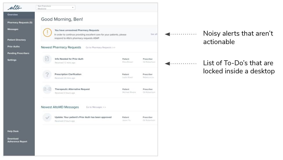
AltoMD relied on email notifications and a desktop web experience.
Navigation was noisy and confusing, and basic functionality was hard to discover and use
Clinicians and MA’s rarely check their email and demand mobile-friendly experiences
PROVIDER EXPERIENCE PRINCIPLES
Developed as part of research interviews with Alto and new-to-Alto providers, guiding lights to what the experience should be:
Drive efficiency
Alto saves time and energy for providers and frees them up to do what they do best - consult with patients.
Increase patient satisfaction
Alto creates delightful moments for the patient, and between the provider and patient (i.e. great treatment at a low price).
Be consistent
Alto is a reliable partner that follows-through on promises you make to the patient.

Early matrix prioritizing AltoMD pain points.
DESIGN INTO
THE PROBLEM SPACE
Hypothesize. Collaborate with Product and Engineering on where the highest leverage, most strategic bets should be made.
Envision. Chart a path towards a compelling “north star” from which near-term features could work towards.
Sketch. Put down broad strokes that don’t get hung up on exact requirements.
The VISION
Making AltoMD mobile was killing 2 birds with one stone. It would enable faster back-and-forth between the providers and pharmacy which would be a win-win for both parties.
Furthermore, it was a chance to re-think AltoMD from the ground-up without having to entirely redesign a platform that was currently in use by hundreds of clinics.

MANAGING THROUGH ADVERSITY
However, resistance to building a new app was high - a patient native app the year prior had taken up quite a few resources, but resulted in only gradual adoption. Our team’s product manager, though having deep knowledge of the provider problem space, had little understanding of mobile technology.
Alto is a docs-driven culture, so I decided to create a proposal that would connect the dots between the provider pain points as well as outline the concerns around technology.
I drew from my own background in native apps and responsive web to describe in detail the trade-offs (responsive web wouldn’t get us push notifications) and circulated

OPPORTUNISTIC APPROACH
Meanwhile, since our team had no dedicated engineering, I enlisted my under-utilized junior designer on a “secret” project. It would do double-duty, giving her meaty work to sink her teeth into while also developing concrete click-throughs that could be tested with providers.
We drilled into Push Notifications as distinguishing the need for a native app:
More likely to be acted on than email notifications
Ability to go straight from notification to resolution
Get some context at a glance
PROTOTYPES FOR BUY-IN
I pushed my designer to develop different points of view for the project. My approach is always to tease apart directions as far as possible from each other in order to illicit strong reactions and learn the most. So when my designer nervously brought her first mock-ups to review with me, she was surprised when, instead of nitpicking what I knew to be quick wireframes, I instead encouraged her to move to the next idea - iterate quickly until we found those ends of the spectrum.
She was able to develop 3 strong directions that would push providers to say how they most wanted to navigate quickly.

NEW LEADERS, NEW BUY-IN
Changes in upper management allowed a new forum to revisit what should be on the immediate strategic roadmap. Piggy-backing on the research and work the team had already done, gave our new Director of Product confidence to present a mobile option as the 6-12 month investment the team needed to make.
When there was a moment of hesitation and whether we could get a signal sooner, being able to use the prototypes to bring into immediate testing became the critical lever to getting buy-in.

ITERATE & FOCUS
Evaluate. With our early, low-investment prototypes, we can quickly gather to users’ desirability, as well as red flags.
Edit. In partnership with Product and Engineering, ruthlessly cut scope for both time and clarity (what did providers REALLY need as a P0?)
Paint in the details. Continue to deepen and expand explorations to continue edge cases, error states, layout and UI.

CONCEPT EVALUATION
With a new UX researcher onboard, we were able to quickly orient her on the purpose and goals of the prototypes and what concept evaluation could bring the team.
The findings further gave confidence to our direction as well as help cut down scope to the bare essentials.

FOCUSING SCOPE
It was clear that providers founds lots of value in Alto and AltoMD, but were just frustrated by wanting an easier, faster way to resolve issues.
So we centered on the this job-to-be-done, and all others could be up for the chopping block, as the team sought to avoid noise and distraction from the primary goal.
PUSHING THE ITERATIONS
Meanwhile, our original designer had swapped roles with another designer, which was a nice opportunity to take the originals, research and renewed focus, and play with the UI. The new designer tended towards a conservative approach to iterations, so I pushed him to “find the fun” - providers frequently talked about wanting to “zero out” my inbox. How could we reinforce that sense of delight in AltoMD, making it sticky and addictive in a sea of boring, mind-numbing tools?

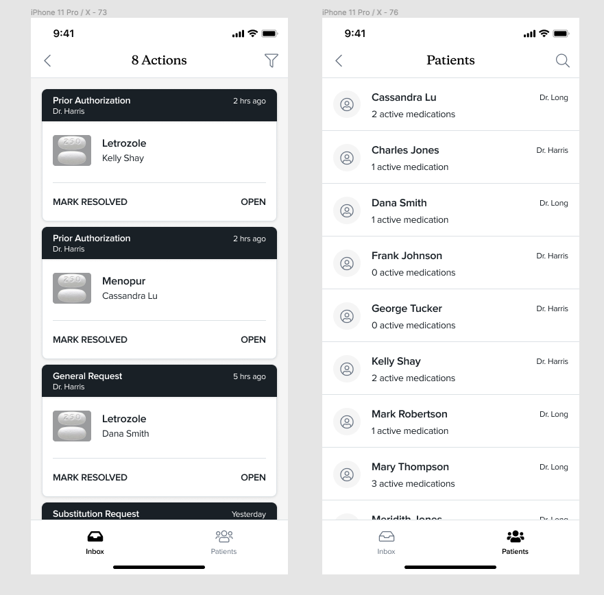
Memorable
After all the iterations, our designer finally landed on a card metaphor that rang true to the team:
Simple buckets for easy learnability
Cards that replicate the ease of finishing up a fax
DESIGN SYSTEMS AND MOTION
Another staff change meant that we needed a new designer to bring it to the finish line. Our design systems designer was eager to use the project as a way to bring some of the design components in other libraries into line.
Once again, we needed to onboard a new designer, center her into what providers wanted, and further refine the UI to reinforce a sense of efficiency and speed. She used motion to really bring this to life

IMPACT
AltoMD Mobile Alpha is targeted for a release of 5 clinics in February 2021.
AltoMD 1.0 is targeted for general release by the end of 2021.
We are currently incorporating the learnings from the Mobile project back into Desktop.